HR Homepage
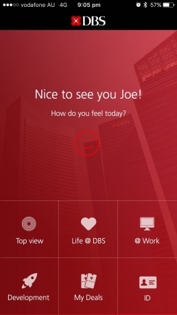
The design of the interface is used to facilitate these everyday tasks as shortcuts.
Icons, descriptive titles plus the navigation closer to the bottom makes the app intuitive an easy to use.
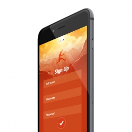
External Home Page
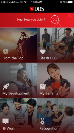
This screen answer to this question:
What’s the most routine job that the user does on a daily basis?
This screen is performing the same sequence of actions implemented by an intuitive grid.
Barcode to Access
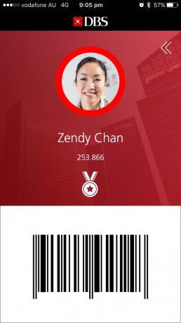
Easy access to Barcode is simply swiping the screen, then without even seeing the screen the user can have access to the building showing their Barcode.
Less is More even in UX.
So easy!
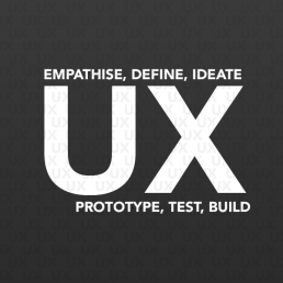
The UX Process and then the UI style for a Corporate App
Familiarity
Our eyes love seeing familiar and straightforward things, but talking about corporate it means to bring the brand to these levels surprising users in the meantime to make them comfortable.
We used common sense solutions based on a grid without feeling guilty. As a result we get an extremely user-friendly app.
Conventional layouts will seem less complex just because they’re familiar. It is a corporate app to navigate every day.
Here’s a short list of things we kept in mind in our design thinking approach:
• Grid Navigation
• Consistent Interactions
• Familiar Icons, Photos and Titles.
• Calls to action—links, buttons using simple shapes
• Common color codes
Efficiency
We answered this question in every single action, screen.
What’s the most routine job that the user does on a daily basis?
Is it content entry, editing, or viewing?
Base on it the UX is performing the same complex sequence of actions.